Intro
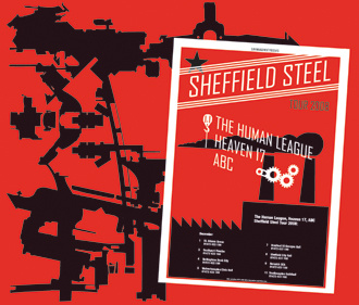
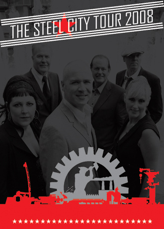
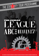
"Sheffield Steel Tour" or "Steel City Tour" was an idea to which
they needed a tour poster. This was followed by a mail
containing various Russian propaganda poster pictures from the 1950's. "Can you make something out
of this?" Simon Watson, the manager, asked me.
Theme
I love when there is a theme that spawns heaps of ideas in my
head. Alot of construction designs emerged, and I had a great
little software which I got a few years ago, and figured it
could be handy at one point. What it does, is that it randomly
generates very messy pictures, full of colourful elements. These
elements looked like construction bits and pieces. Now, as it
was made for website backgrounds (flash), it couldn't easily transform
to hi-res printing, so I had to lift out the various elements,
and trace them, to get an outline vector based version. Then I
had to align each, as the lines weren't as I wanted it. Adding
to that, I found alot of mechanic/industry vector graphics, such
as gears, chimneys and cranes.
Messing around with various tour poster designs, it was decided
to use band logo's instead of the typeface used. First I got the
Heaven 17 'Endless' logo in poor resolution. A few postcards and
posters and magazine/newspaper ads used this, but it was
luckily changed to what I proposed - the
original 'Luxury Gap' logo to give it balance.... well, almost original, as I had to redraw
it from scratch. Did the same with the ABC logo -
alot of measuring etc., but I need a fully vectorbased logo to
play around with! :-)
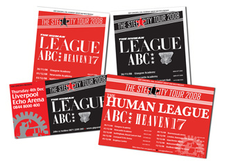
The designs in black and red were forwarded, and a few changes
were made, before they were approved. I can tell you the size of
the individual band logos were an issue! However, I did learn
that the running order of bands, is often the opposite as on the
bill. I also learned that what I originally suggested, was
really messy, but with a push here and there, from the manager,
it suddenly all looked much better - and perhaps most
importantly catchy for the eye.
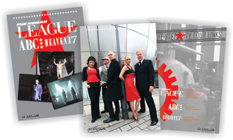
Tour programme
All the elements from the tour poster, was thrown into a one of
my
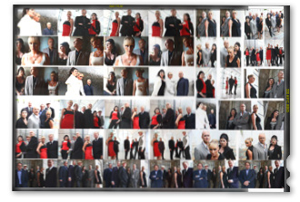
templates. I recieved the photo session CD, containing
240 various pictures!! It was fantastic going through them
all - also hard to choose, but decided to wait with choosing
until I knew what was to be on each page - this is usually the
most painful, as it has to have some sort of direction and
balance through the programme.
Out of the blue, came an opportunity. A
power plant close by, opened their doors
for the public, to celebrate their anniversary - meaning lots of noisy
kids with baloons, BUT also an opportunity to take some photos -
I took a few, and 4 of them are used as backdrops in the programme.
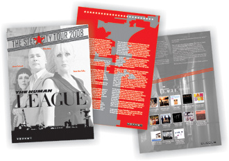
Almost every time, I'm nervous about the text part. What is
there to write, that haven't already been written? A edited
version of an older Simon Price text were used for the THL part,
and texts were provided from H17 and ABC. I always add a
discography, purely because I bet the random concert goer, may
not even know half the releases, and hopefully will be tempted
get some of the stuff - beside, that's what I want to read in
programmes for other bands.
Made some icons for my company, and liked them, so I used them
again on every page - the idea was something like this:
Stars Steel
Music Band
Members Page


Data:
Pages: 20
Size: 240 mm x 340 mm.
Paper: heavy hi-quality glossy.
Fan
photo credit: Richard Price

Merchandise
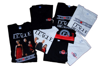
I got some info about the amount they wanted to do - less
than last year, as also H17/ABC were on sale. They wanted a tour
t-shirt with all bands, so that was just basically the tour
poster, plus I did one with a picture and one with the gear...or
to put it another way - one for younger people and one for old
people like myself! This year around, my good friend Niels, who
also runs a
League site, had a saying in the picking of what was
to be sold. He has several times pleaded for a worker shirt (se
above - re: older people), over the years, and if there ever was
a reason to make one - this surely was the one. Simon was in
doubt - I could sense it, but it was approved and Firebrand went
with it...."If this doesn't sell, I'll dump the load on your
doorstep" was the message to Niels...
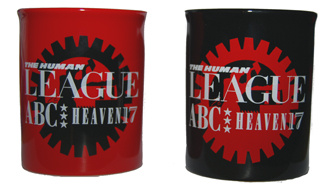
Other than that, two mugs one black and one red was produced.
|
 |
 |