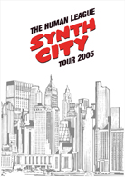
'Synth City' was Oakey's idea, as a tribute to the movie of
almost the same name.
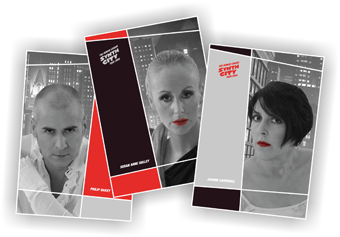
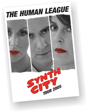
This was great fun - a logo! a logo that could be placed on
practically everything. Instead of a ordinary programme, it was
suggested to do a postergramme. A cut-out of previous
photos of individual band members - a bunch of effects, gave it
the comic/cartoon-esh look, combined with dividing up the
programme in cartoon boxes. The first version included Oakey
with red lips as well, but that was rejected.
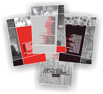
The city scape on the front and back, is a scanned sleeve of the
band's first single 'Being Boiled' - everything seemed to go
together pretty well together. I still feel this is visually the best
work I've done for the band so far.

Data:
Pages: 8 - poster on the other side.
Size: folded A4 210 mm x 291 mm.
Postersize: 840 mm x 594 mm.
Paper: light hi-quality matte.

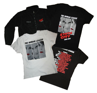
Other than the postergramme, mugs, t-shirts, a fleece, a beanie
hat and a black bag with SC logo's were produced.
|
 |
 |