The
theme this time around was given. I was told that the album Dare!
would be played in it's entirety, and the whole stage setup etc.
would fit the Dare-theme. I dusted off my vinyl
versions of the album, and in short - it's simple - on the brink
of being boring - but as fans know, that was the whole idea - to
keep it timeless. I was also
told that Philip Oakey wanted the programme to be simple, so that kind of
put a few restrictions on what to do.
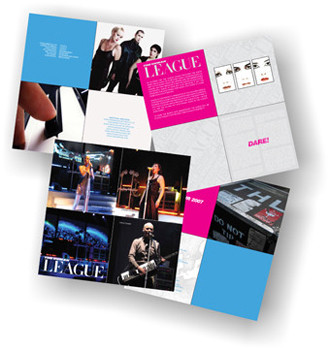
The innersleeve on the original album, is divided in four
squares, and I decided to use that as a line within the
programme - making it "album" square, was of course also a must
- not only to keep in faith with the Dare album, but also to
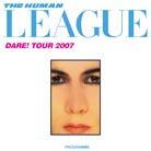
do something new. The sacred logo got yet a new brush
over, and I tried matching the original colours from the album.
Of those three album version, and two CD versions I have, I
learned that there is a slight colour variation in the blue logo
colour and the pink Dare!, on all 5 items! anyway, I tried to
find compromising colours - so it ended up being a tiny bit
deeper blue on the THL logo, and a tiny bit stronger pink on the
Dare! title....(are you still awake?)

As it were, I couldn't get my hands on new photos - oh, I
begged...and begged. It was decided to use old photos, and I
recieved a package with transparencies photos from various periods - lot's
of them - images I had never seen before, mixed with well-known
photos from various magazines (now with no text upon them :-))))
- anyway, I decided to use only but a few, as they had to come
from around 1981.
Content: a marvellous text by Simon Price, which were placed in
the programme in the last second, delaying the printing in a way
so it wasn't on sale during the first two gigs.
At an early stage, I was unsure about what to put in the
programme. For the first time I knew what
was going be played beforehand, so
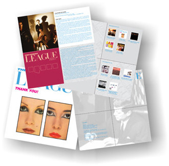
I decided to add all the lyrics from Dare! I envisioned people not knowing the lyric, would read up from the
programme during the gig....well, I did! I also wanted to make a
backdrop to each song, which gave me a headache + alot of
re-listnings, and trying to remember what Oakey may or may not
have said about each song during time. I find it a bit funny
that Philip once said that 'Do or Die' was based on the movie
Carrie featuring Sissy Spacek - no problem - a photo was found....and
then Philip tell us the song is about being sexy - Sissy Spacek
is everything BUT sexy!
I liked the idea of a new intrepretation of each
single-sleeve - only using graphical elements and no photos -
it may look fairly simple, but it took hours in measuring and
matching up colours etc.

Finally I flicked through the 450 photos I took last year, and
picked a few of the good ones (and there were only a few good
ones!!).
About a week before the first gig, I finished, and it was
handed (uploading a 200 MB prepress PDF!) over to Firebrand Ltd. who also produces all the various
merchandise items - I was asked for suggestions, and a
combination with those of Firebrand's, ended up
being sold throughout the tour.

Data:
Pages: 24
Size: 280 mm x 280 mm.
Paper: heavy hi-quality glossy.

The faces from the Dare sleeve used both on the huge curtain and
projections on stage, holds a story of their own. Seems that both Oakey and Virgin
tried to get hold of the original
Brian Aris photos, but without
success - rumour has it Philip were on his attic crawling around
for the original artwork (cromalin), but sadly it was not to be
found. I did a hi-resolution scan of all the faces, which again, were given the Photoshop
treatment - took hours to remove grains, colour correction etc.
They ended up being 35 MB each - hell of a time to upload -
really boring info - but there you go :D
On the first few PDF previews forwarded to the manager, I had
put in a X 2008 (STUDIO ALBUM) in the discography section.....not
a word...so I removed it! :-)
I had a talk with their visual guy (Rob Sinclair), and I
suggested them using some of Adrian Wrights old slides. One
thing is suggesting them, another is to actually find usable
ones. I did try to obtain them through people who I knew have
the original Dare Tour programme, but due to time issues and
other things, I ended up using every trick in Photoshop to
enhance the low-resolution versions I have. Really happy to see
that Rob actually used them during the 2007 tour....even if I
was the only one noticing it.

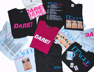
I don't think there has ever been so many different merchandise
items - a whole bunch of t-shirts with various logos and colours.
The programme, a black fleece, a mug, a winter hat, a bag, a key
ring, and hot pants!
I pledge...one day - my arse will fit those hot pants.....
|
 |
 |