Here I will try to describe the creative process of
making the sleeve(s) for Michiel's/Nukove Records Benelux 12"/CD single release of 'Love Me Madly?'.
AIEW Design:
When Michiel approached me with the idea, I was of course very
ecstatic and happy. We discussed the possibilites, and we both agreed on
that it had to look like a follow-up to the 'All I Ever Wanted' single.
Michiel suggested live photos, but both live photos and promo photos can
cause trouble with both accept from the band and copyright issues.
I already had the template (done in CorelDraw 10), as I did a sleeve (for
myself) of the promotional single 'You'll Be Sorry'. But this time it had
to be perfect, so alot of measuring and scaling was done. Secondly the
League logo had to be re-done, as I found very small errors in the one I
did earlier.
Colouring:
Looking at a perfect template, made me play around with the colours. The
AIEW single has a vague fading of colours, which I also had to reproduce.
I did 15 colouring tests
(1),
which was totally stupid, as I couldn't decide on colour, before I had
images to go by.
Heart:
How do you graphically describe love, without a heart?. It was
my first idea, and I skipped through many high resolution images in my CD
collection, without finding one I liked. As I have earlier done some
freehand drawing, I was about to do one on paper, and then scan it, but I
thought I was gonna give the airbrush tool in Photoshop, a try first - a
tool I have never used before. It turned out well
(2),
but was still lacking the frantic nature of the song. I listend to the
track over and over, and read the lyrics. I then decided to make three
hearts - a "love me well" heart, a "love me badly" heart, and finally a
"love me madly" heart. I placed them in the boxes in that order
(3).
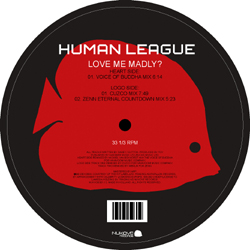
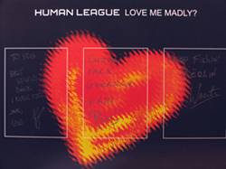
The "madly" heart was the original heart, with added yellow and some
Photoshop effects, to give it a more frantic look, and it really dominated,
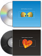
so it got it's own sleeve - this one ended up as 12" sleeve
(4).
Kissing:
This was tricky. I wanted a arty image of a kissing couple.
Again I looked through a dozen of images, but no one were good enough. Then
I came up with the desperate idea of asking my wife to do some kissing
with me, while trying taking the image myself at the same time - NOT EASY!.
I had around 10 images, and I was giving them all the Photoshop treatment
to get the arty image I wanted. It was a balance between making it obvious
what was happening in the photo, but also hide me as much as possible! Only two came out
as I wanted
(5).
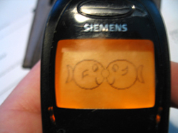
Stick man:
This was mostly for fun. Michiel certainly didn't like it, and I am not
sure I do either. LMM is actually a humours song, and I decided to try
giving it just that angle. Originally the two characters both had a head -
no eyes, but a mouth showing their mood. I dropped the heads, as it's
pretty obvious what's going on.
(6)
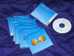
Fish:
The frantic nature of the song, made me think "what could possibly be
the worst kind of love you could be exposed to", and it suddenly made me
think of those nasty spiders, who lives by the rule "mate and eat your
partner" - now spiders are one thing, and wouldn't look good on a cover,
unless you're a deathmetal band, so I took it in the opposite direction, but stayed in the animal world -
now what can be more quiet and peaceful looking than those two fish? -
contrast is the keyword. I did a few more sleeves where the fish were
within the boxes, but it didn't work, and only the blue one survived
through to judgement; ending up as the CD single sleeve.
(7)

Promotion:
To celebrate the forthcoming release, me and Michiel made a
small promotional website
(8).
I've uploaded it again, so click on the image --> right, and a
pop-up window should emerge.
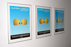
Other than that, I made a bunch of poster suggestions - of which
fan forum board members could choose between 8 different layouts
- of course Michiel had veto, but we ended up with a combination
of two of them.
(9).
2 different posters were produced in size 100 x 70 cm.
At "judgement day", I didn't knew Michiel was going
to release both a CD and a 12", and there was no hesitation to his choices.
I actually did the fishes, without knowing that he enjoys diving - a
stroke of luck, which also made the Nukove logo pretty much easy to do.
It's the same fish, but ray-traced to an out-line image, which can be
scaled and coloured any which way you want.
The rest is history, and can be found on
www.nukove-records.com


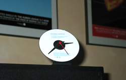
Michiel van
Bokhorst made a clock for himself of the CD!
Signed by the remixers.
My old Mobile phone.
|
|
|