Intro
2010 started with the expectation of a new album being released.
I (of course) had dropped the word that if they wanted me to
have a go at some layouts, they just have to say the word. I
wasn't actively pursuing the matter, as a) I didn't know what
direction it was going, and b) I had zero new images to work
with and c) busy times at work, as our company got bought (I had
to redesign ALL our sales material). It might also be worth
mentioning, that I'm very humble about all this, and I don't
consider myself as an official working relationship - just
a fan, who likes to support the best band on the planet. So I of
course thought that with their new record deal, they had it all
covered.
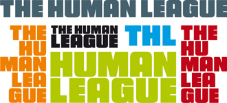
During the summer I was asked for a bold typeface THL logo
for the first version of their new website. I was told that
Oakey was inspired by the typeface used in a Nick Fury comic
book. I couldn't find a similar font, but did one, and uploaded
it to their site.
The temporary logo was also used in the early start
of the tour announcements. At that point, I knew it was going to be
changed, but I didn't know to what.
This of course promted me to
have a more serious go at the single- and album designs which I
was determined to forward, without knowing
anything about what they wanted.
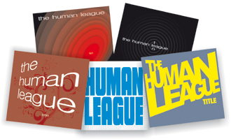
Sleeve design suggestions
Over the years I had done numerous THL logos, sleeve designs
ideas, tests - not anything really good, but I definitely
revisited all the old designs. Below you'll find some of my
earlier attempts - and please note it's rough designs, ideas -
nothing concrete I dared forwarding to the bands manager.
When I finally had something I found worthy of a presentation,
it was a bit too late in the proces, and the whole thing got a bit lost in
translation, and they were already hooked on the design that
Philip Oakey had done - hard to compete with him!
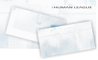
When starting something new, I tend to want to have some sort of
back/photo/colouring before I start. A logo or text will always
be enhanced if the backdrop is supportive and/or cool looking. I
started by scanning a piece of A4 squared paper, and adding some
Photoshop effects etc. Then I turned it into vector graphics, so
I could easily work with the layout.
I wasn't satisfied and during the proces, I was asked about the
beforementioned simplistic large logo, which made me drop all
the concepts I worked on, and dived into the 'simple and large'
logo idea.
I wanted something different, so I played around with the "tour
logo" I just had done.
If I wanted the logo large and different, and still making room
for i.e. a photo or drawing, I decided to go with the League
name being split (red and orange above). Which then lead to
these ideas:
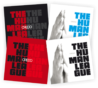
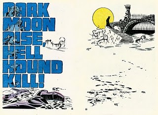
I couldn't quite shake the idea of having the band on the sleeve,
so I also tried a few backdrops with older pictures, but it
simply didnt' work. Below a few of my Photoshop mash-ups.
I
then decided to see if I could still draw something by hand....I
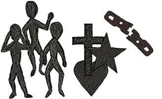
couldn't, but that didn't stop me! I wanted to embed some sort
of relevant theme for each sleeve, so I went with some small
dark people for the Night People designs, a chain for the second
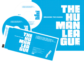
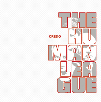
single, and some symbols for the Credo design. The chain was
chosen because back in 2008 I got a demo CD by Mr. Oakey himself -
it contained early versions of some of the tracks from the new
album, and as I really liked 'Breaking The Chains', I used that
as a design suggestion for the second single.
The below was what I finally forwarded to their management,
which got a positive response, but as mentioned earlier - too
late!
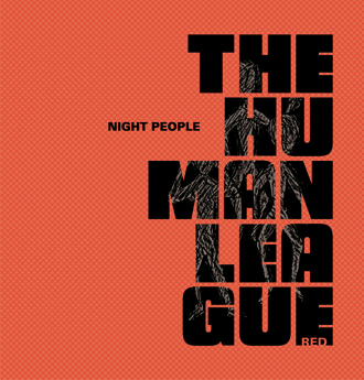
12" design
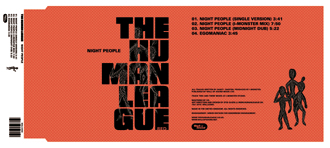
CD single design
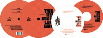
12"/CD labels
CD single 2
Album
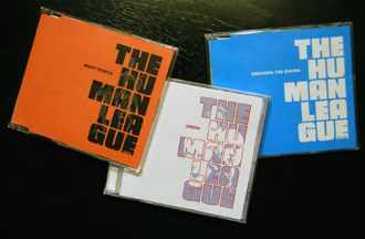
Printed and in jewel cases
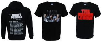
Merchandise
At an early stage I saw the designs for the single and the
album. I was asked for ideas, and as I didn't had a hi-res
version of the new THL logo, I redraw it from a PDF of the album
sleeve I got. Hard work, but as always - having a perfect
vector-based logo is always preferred. Seeing it was going to be
a 'Night People' tour, I suggested a hooded shirt among other
things - personally I thought the 'Night People' condoms were an
excellent idea, but not sure they would sell that much. Sadly
there were not much material for a tour programme, so atleast I
didn't have to work late hours finishing that.
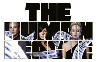
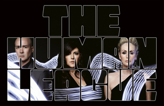
One of my suggestions were to embed the new band photo by Spiros
in the new logo - the reason for that is that it would fill up
alot on a t-shirt + if you were to add the THL logo, it would be
to large to fit. The final design was done by the merchandise
company Firebrand Live, but I made another one, which is now
being used in promotion of gigs in 2011.
 |
 |
 |
